
Lettering that looks refined on a laptop can fail as soon as it reaches a car. Thin strokes disappear, carefully spaced words become difficult to read, and a door seam can split a letter at exactly the wrong point.
The problem is not simply one of size. Vehicle typography has to work on a curved, segmented object that may be seen while moving, parked at an angle or reduced to a small photograph on a phone. A designer must consider the car, the viewing conditions and the surrounding graphics at the same time.
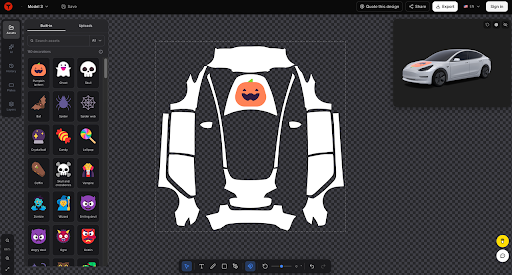
Before committing to a layout, designers can design Tesla wraps online and inspect the lettering on a three-dimensional vehicle. This changes the review from “Does the type look good on a flat canvas?” to “Does it remain readable on this particular body shape?”
Consider a photographer who wants to create a digital wrap concept for a Model Y. The design includes a short studio name and an abstract aperture graphic. The first version uses a narrow, lightweight sans serif stretched across both doors. It looks elegant in the original layout, but the vehicle preview exposes several problems.
A Vehicle Is Not a Flat Page
Editorial typography is generally viewed from a predictable direction. A page, screen or poster presents a relatively stable rectangular surface. A car does not.
The Model Y’s body curves towards the front and rear, while the windows, handles, doors and wheel arches interrupt the available space. The viewer may see the lettering directly from the side, but they are just as likely to approach from a three-quarter angle.
In the photographer’s first design, the studio name crosses the gap between the front and rear doors. One letter is divided by the seam, making the name appear misspelled from certain angles. The final letters also sit on a section of bodywork that curves away from the viewer, so the word appears shorter and more compressed than it does in the flat artwork.
The solution is not necessarily to make everything larger. The designer first needs to find a more stable area of the vehicle.
Choose the Typographic Zone Before the Typeface
Designers often begin by testing fonts, but placement should come first. A suitable typographic zone has enough uninterrupted surface area for the word or phrase and does not compete with handles, lights or strong panel changes.
For the Model Y concept, the studio name can be moved entirely onto the front door rather than extending across two panels. The aperture graphic can remain towards the rear, creating a relationship between the two elements without forcing the text to bridge a seam.
A safe placement should also allow room around the letters. Type positioned too close to a wheel arch or window edge may look trapped, even if no character is technically cut off.
Once the available area is understood, the designer can choose a typeface that fits its proportions.
Use Weight to Survive Real Viewing Conditions
Fine typography can convey elegance in print, but a vehicle introduces distance and movement. Hairline strokes that appear sharp at full zoom may disappear when the car is viewed from across a road.
The photographer’s original narrow light typeface is therefore replaced with a medium-weight sans serif. The new choice still feels contemporary, but its strokes remain visible when the vehicle preview is reduced to the approximate size of a social media image.
Weight should be tested together with contrast. Light grey lettering on a silver body may appear restrained on a colour-calibrated monitor but become difficult to distinguish in overcast light. A darker charcoal or a controlled block of contrasting colour can improve legibility without making the identity feel aggressive.
The objective is not maximum contrast in every case. It is sufficient contrast under realistic conditions.
Adjust Spacing for the Shape of the Car
Default letter spacing is designed for conventional reading surfaces. It may not account for reflections, panel curvature or the interruption created by vehicle hardware.
Slightly opening the tracking can help a short name remain distinct at a distance, particularly when the typeface has narrow counters or compact proportions. However, excessive spacing can make the word lose cohesion, especially when it is already stretched across a long horizontal area.
The studio name in the example is short enough to tolerate moderately wider tracking. The designer tests it at several preview sizes, checking whether the letters still read as one name rather than a collection of separate symbols.
Kerning deserves individual attention as well. Pairs such as “AV,” “TA” and “LY” may create uneven gaps that become more obvious when the lettering is enlarged. Automatic kerning is a starting point, not a final decision.
Establish a Clear Hierarchy
Some vehicle designs include a brand name, descriptor, web address, social handle or short slogan. Giving all of them equal prominence creates confusion.
The most important message should be identifiable in a brief glance. In the photography concept, the studio name becomes the primary element. A descriptor such as “Portrait and Editorial” may be included at a smaller size, but it should not compete with the name or become so small that it is unreadable.
Long web addresses and multiple contact details are usually poor candidates for prominent vehicle typography. They encourage smaller type and longer lines, both of which make the design harder to absorb quickly.
If secondary information cannot remain readable at an appropriate scale, removing it may improve the design more than another round of typographic adjustment.
Let the Graphic Support the Type
The aperture motif should reinforce the photographer’s identity without behaving like a second headline. In the first layout, the graphic sits directly behind the studio name, creating uneven contrast across the letters.
Moving the motif towards the rear separates the two functions. The name communicates identity; the graphic adds recognition and movement. Repeating one curve or colour from the aperture near the text can connect them without merging them.
Negative space is particularly important on a vehicle. Reflections, body details and the surrounding environment already contribute visual activity. Empty space gives the lettering enough separation to remain clear.
This is also why decorative outlines, shadows and gradients should be used cautiously. An effect that appears to improve contrast on a flat mock-up may make letterforms look blurred when seen at a distance.
Review the Design From Realistic Angles
A side view is useful, but it is the easiest possible test. The design should also be examined from the front, rear and both three-quarter angles.
During this review, the photographer’s studio name remains readable from the front three-quarter view because it now sits on one door. From the rear angle, the aperture graphic is visible while the name naturally recedes. This is acceptable: every element does not need to dominate from every position.
Designers should also inspect the wrap at several scales:
- Close enough to check kerning and edge quality
- At a normal on-screen vehicle size
- Reduced to a mobile thumbnail
- From a simulated distance where only the main hierarchy remains visible
If the brand name survives all four views, the typographic system is more likely to be robust.
Treat Text Generated by AI as a Placeholder
Generative tools can be helpful when exploring colour, atmosphere and broad composition, but generated lettering should not be assumed to be accurate. AI images may contain malformed characters, inconsistent spacing or words that only resemble language.
Any important name, slogan or contact detail should be entered and typeset deliberately in an editing environment. The spelling, punctuation, font licence and alignment all require human verification.
Protected logos and typefaces also need attention. A font available for personal experimentation may not permit commercial branding, and a generated symbol may unintentionally resemble an existing mark. Designers should verify usage rights before a concept moves into public or commercial use.
Separate Digital Preview From Physical Production
Tesla Wrap Designer provides a way to explore a digital concept and examine it on a 3D vehicle. That preview can reveal typographic placement and hierarchy problems early, but it does not prove how physical vinyl will print or install.
A digital design intended for Tesla’s Paint Shop is not the same as a print-ready file for an exterior vinyl wrap. Physical production requires appropriate templates, colour management, material selection and installer review. Curves, seams and stretching can affect lettering in ways that a screen preview cannot fully predict.
The finished PNG can be uploaded in the Tesla app through Creations → Wrap → Upload, or placed in a Wraps folder at the root of a USB drive and selected on the vehicle under Toybox → Paint Shop. Compatibility with the particular Tesla model, software version and region should still be confirmed before import.
Typography Has to Move With the Object
The final Model Y concept is simpler than the first. The studio name uses a stronger weight, slightly wider spacing and a stable position on one door. The aperture graphic occupies a separate area, while secondary text is reduced or removed.
Nothing about the revision is dramatic when viewed as a list of changes. Together, however, those changes transform attractive lettering into typography that belongs on a vehicle.
Good vehicle type does not merely sit on the bodywork. It responds to panel boundaries, viewing angles, motion and distance. When those conditions shape the design from the beginning, the result can remain clear without losing personality.
Tesla Wrap Designer is an independent tool and is not affiliated with Tesla, Inc.
 hamza seo