
AI font tools have made it much faster to explore lettering styles.
A type designer, brand designer, or independent creator can begin with a short description and quickly test different directions: sharp editorial lettering, soft retro forms, futuristic display type, hand-drawn characters, or a wordmark built around a particular mood.
But generating a strong two-dimensional letterform is often only the beginning.
The same lettering may later need to appear in a product launch video, a website hero section, a virtual event, a social media campaign, or a three-dimensional brand installation. At that point, the designer has to think beyond the front-facing outline.
How thick should the letters be? What should the sides look like? Should the edges remain sharp or become rounded? How will counters, curves, and narrow spaces behave once depth is added?
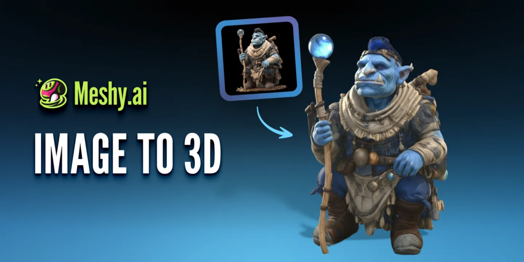
AI-generated 3D tools can help type designers explore these questions without building every letter from scratch.
The aim is not to replace professional type design or 3D modeling. It is to create a faster bridge between a flat typographic concept and a spatial visual asset.
Why Type Designers Are Moving Beyond Flat Lettering
Typography has always existed in physical space.
Letters have been carved into stone, painted onto signs, cut from metal, printed onto packaging, and built into architecture. Digital design did not remove this spatial quality, but it often reduced typography to a flat image on a screen.
Today, brand lettering needs to work across more formats.
A logo may appear as:
- A rotating object in a launch video
- An animated website element
- A virtual stage sign
- A metallic title in a fashion campaign
- A floating wordmark in a game environment
- A 3D-printed display
- An AR object
- A motion graphic for social media
In each case, the type is no longer only read from the front.
It becomes an object with thickness, edges, surfaces, shadows, and materials.
This creates opportunities for designers, but it also introduces new decisions.
Start with a Strong 2D Typographic Concept
A successful 3D result still depends on a strong flat design.
AI font generation can help designers explore a wider range of starting points, but the output should still be evaluated as typography.
Before moving into 3D, check:
- Letter spacing
- Character proportions
- Stroke consistency
- Readability
- Counter shapes
- Curves and corners
- Baseline alignment
- Relationship between letters
- Whether the style matches the brand
A visually dramatic wordmark may still fail if individual characters are difficult to read or if spacing breaks down at smaller sizes.
It is better to correct these problems before adding depth.
Three-dimensional effects can emphasize strengths, but they can also make weak spacing and inconsistent forms more obvious.
Prepare the Artwork for 3D Generation
The source image should be simple and easy to interpret.
For a wordmark or lettering design, the best reference usually includes:
- One main piece of text
- Strong contrast between the lettering and background
- A clean or transparent background
- No unnecessary shadows
- No overlapping decorative objects
- Clear internal spaces
- Sufficient resolution
- Minimal blur or texture noise
If the artwork contains several words, complex symbols, or decorative elements, it may be more effective to separate them and generate each part individually.
This is especially useful when a logo combines lettering with an icon.
The icon and wordmark may need different depth, material, or scale, so treating them as separate assets gives the designer more control later.
Turn the Lettering into an Initial 3D Form
Once the design has been cleaned up, it can enter an image to 3D workflow.
The system interprets the visible letterforms and creates an initial three-dimensional model with estimated depth and surface information.
This is useful for rapid experimentation, but the result should be treated as a draft.
A flat image does not explain:
- The exact thickness of each letter
- The shape of the back
- The angle of the sides
- The depth of counters
- How overlapping characters should separate
- Whether the object should be hollow or solid
- How sharp the bevels should be
The generated model provides one possible interpretation.
The designer still needs to decide whether that interpretation supports the original typographic idea.
Check the Details That Matter Most in 3D Type
Typography has structural features that ordinary objects do not.
Small changes can affect both readability and style.
Counters
The internal spaces of letters such as O, P, B, R, and A need to remain open and recognizable.
If a counter becomes too narrow or closes during generation, the wordmark may lose clarity.
Kerning and spacing
Letters that look balanced in a flat image may feel crowded when depth and shadows are added.
A narrow gap between two characters can become visually heavy from an angled view.
Serifs and fine strokes
Thin serifs, terminals, and high-contrast strokes may become fragile, distorted, or difficult to read in 3D.
They may need to be thickened or simplified.
Curves
Smooth curves require clean geometry.
Uneven surfaces may become visible when reflective materials or strong lighting are applied.
Ligatures and connected lettering
Script lettering and custom ligatures can produce attractive 3D forms, but overlapping strokes need to remain structurally clear.
The designer should check whether connected areas look intentional from every angle.
Side surfaces
The sides of the letters may become a major visual element.
They can use the same material as the front, a contrasting colour, or a completely different texture.
Decide What Kind of Depth the Design Needs
Adding depth is not a single decision.
Different levels of extrusion create different personalities.
Shallow depth
A shallow model preserves the feeling of graphic design.
It works well for web visuals, subtle motion, and editorial-style typography.
Deep extrusion
Deeper letters feel more architectural and object-like.
They may suit bold brand videos, event graphics, and virtual installations.
Rounded depth
Soft bevels can make letters feel playful, tactile, or inflated.
This works well for lifestyle, entertainment, and youth-oriented branding.
Sharp depth
Hard edges can create a technical, industrial, or futuristic appearance.
They work well with metallic surfaces and dramatic lighting.
The correct depth should come from the brand direction, not from the desire to make the design look more “3D.”
Use Materials to Extend the Typographic Idea
Material can change how lettering is understood.
The same wordmark can feel completely different when it appears as:
- Polished chrome
- Transparent glass
- Soft plastic
- Inflated fabric
- Rough stone
- Brushed metal
- Ceramic
- Neon
- Painted wood
- Iridescent material
A luxury brand may use restrained metal or glass. A playful campaign may use soft, inflated surfaces. A technology identity may use reflective or translucent materials.
The material should reinforce the meaning of the type.
It should not simply be added because the surface looks impressive.
Designers should also check whether highlights and reflections reduce readability. Highly reflective materials can break the visible shape of a letter, especially when lighting is complex.
Test the Wordmark from More Than One Angle
A 3D logo should not be judged only from the front.
Rotate the model and inspect:
- The left and right sides
- The top
- The back
- Diagonal views
- Close-up details
- The silhouette at a distance
Ask whether the word remains recognizable as the camera moves.
Some typographic forms work well from a narrow range of angles but become difficult to read during a full rotation. This does not necessarily mean the model has failed.
The designer may simply need to limit the camera movement.
A controlled 30-degree turn may communicate depth more effectively than a complete 360-degree rotation.
Refine the Model Before Final Use
AI-generated models can speed up the first stage, but professional use may still require editing.
Common refinements include:
- Correcting letter proportions
- Reopening counters
- Adjusting spacing
- Smoothing curves
- Cleaning side surfaces
- Simplifying geometry
- Adding consistent bevels
- Separating letters
- Rebuilding thin details
- Correcting texture placement
Designers can export the model and continue refining it in their preferred 3D software.
This hybrid workflow is often more efficient than either extreme.
The designer does not have to build the entire wordmark manually, but also does not have to accept every automated decision.
Where 3D Lettering Can Be Used
Once the asset has been cleaned up, it can support several creative formats.
Brand launch videos
The wordmark can rotate, assemble, separate, or interact with light and particles.
Website hero sections
A lightweight animation or rendered loop can give the identity more depth without overwhelming the page.
Social media content
The same asset can produce short loops, reveal animations, and vertical campaign visuals.
Product mockups
The lettering can appear as raised packaging, embossed surfaces, signage, or physical objects.
Virtual events
A 3D logo can become part of a stage, environment, or presentation background.
AR and interactive experiences
Users can view the brand object in their own environment or interact with it from different angles.
3D printing
Selected designs can be developed into physical displays, desk objects, or exhibition pieces after technical preparation.
One model can therefore become the source for many types of brand content.
Build a Practical AI-to-3D Lettering Workflow
A simple process might look like this:
- Generate or develop the initial font and lettering direction.
- Correct spacing, proportions, and readability.
- Export a clean, high-contrast image.
- Remove unnecessary background elements.
- Generate an initial 3D model.
- Check counters, edges, depth, and hidden surfaces.
- Test several materials and lighting directions.
- Refine the geometry where necessary.
- Create still images, animations, or interactive versions.
- Compare the final result with the original brand design.
Platforms such as Meshy AI can support the transition from image-based concepts to editable 3D assets, while the designer remains responsible for typography, art direction, and final quality.
Keep Brand Accuracy at the Center
AI-generated results can introduce small changes that become serious brand problems.
The model may alter:
- Letter width
- Stroke thickness
- Curves
- Spacing
- Logo symbols
- Brand colours
- Fine decorative details
These changes may be acceptable during experimentation, but not in a final brand asset.
Before publishing, compare the 3D result with the approved logo or lettering system.
For established identities, the front view may need to match the original artwork exactly, while creative freedom is applied only to depth, materials, lighting, and motion.
This protects the identity while still allowing it to expand into new media.
AI Does Not Replace Type Judgment
AI can generate font directions, suggest visual forms, and help transform a flat design into an initial 3D object.
It cannot decide whether the spacing feels balanced, whether a curve belongs to the brand, or whether a decorative effect improves communication.
Those decisions still belong to the designer.
The most useful role for AI is not to finish the work automatically.
It is to reduce the distance between an idea and something that can be tested.
For type designers, that means moving more quickly from a word on a flat canvas to a letterform that can be rotated, lit, animated, and placed inside a wider visual world.
The technology creates more options.
Typography still gives those options meaning.